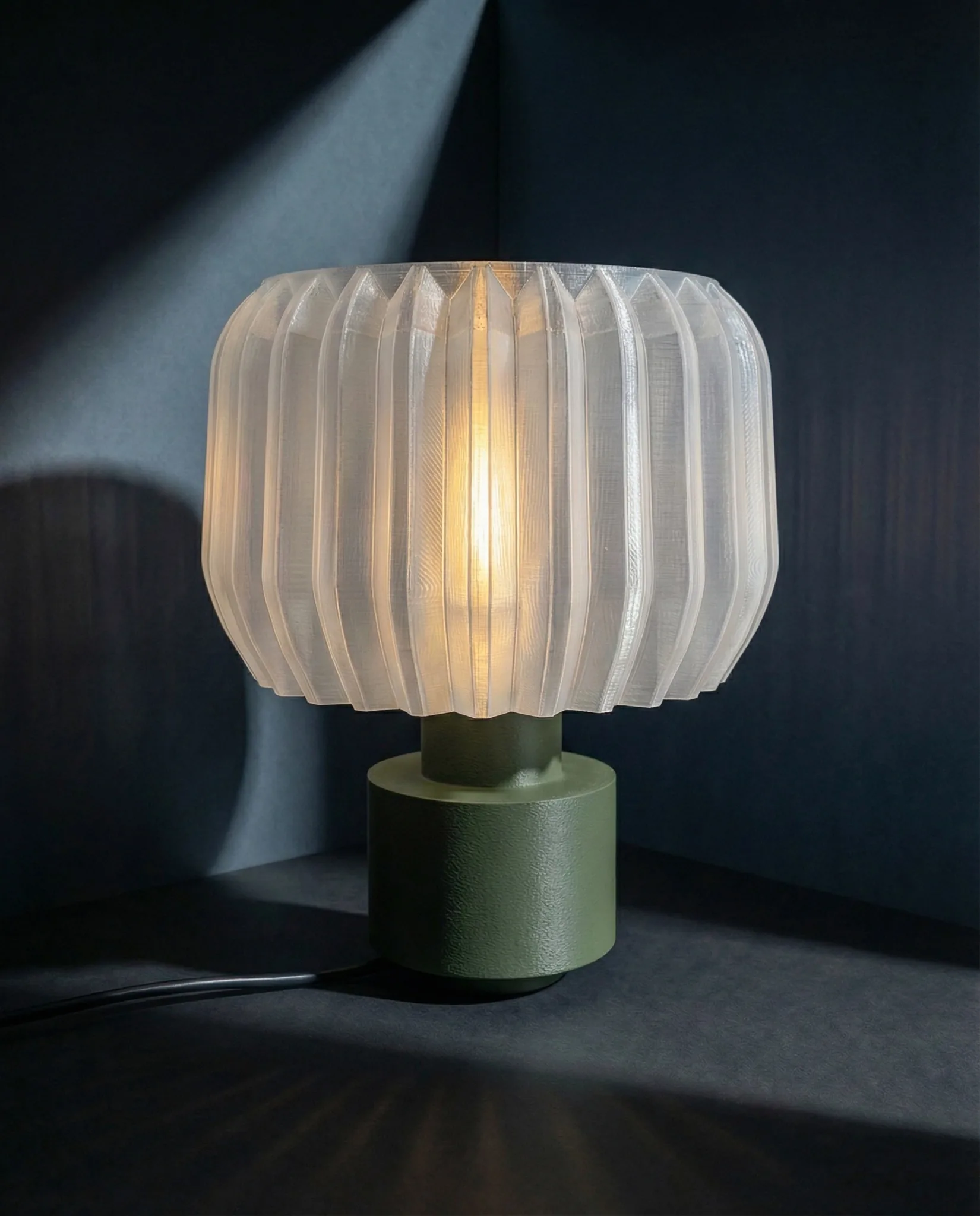
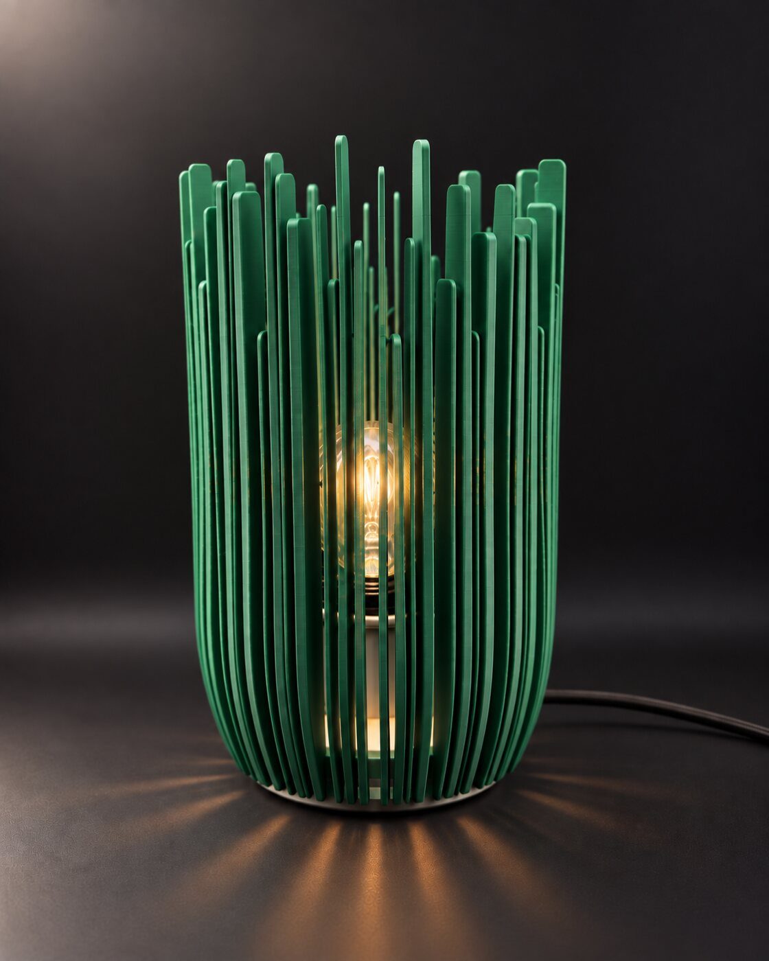
Give the lamp enough contrast to read against the furniture and the wall. Start with shape and shade color, then check how the combination changes when the light comes on.
In this story (6 sections)
Begin with contrast, not a matching wood tone.
A table lamp for dark wood furniture should have a clear outline against its surroundings. Look at the shade against the wall and the base against the tabletop. A pale or translucent shade can separate the lamp from a dark backdrop; a deeper color can work when the wall behind it is lighter. You do not need to match the lamp to the exact brown of the furniture.
There is a seasonal reason to revisit this combination. Trendalytics’ Fall/Winter 2026 home forecast includes dark woods, richer colors and sculptural lighting. That is a design forecast, rather than a rule for your room. Its useful invitation is to try one expressive lamp on a piece of furniture you already own, without replacing everything around it.
Read the furniture and the wall together.
A dark walnut-colored sideboard against a cream wall offers two different backgrounds. The base sits against the brown surface, while most of the shade is outlined by the pale wall. A dark base can therefore feel grounded without making the whole lamp disappear. Against a deep blue or brown wall, give more attention to the shade’s color and the space around its edges.
Try the composition from the doorway before examining small finish details. Put a light and a dark object, roughly the size of your proposed shade, on the surface in turn. This is only a rough visual guide, but it helps you see which level of contrast the room needs. Repeat the check with nearby artwork in place; a busy print can change the outline as much as the wall color.
Use amber when you want a connected palette.
An amber shade can sit comfortably among warm brown furniture, rust textiles and cream walls. RHYTHM in Amber brings a wavy shade and dark ribbed base to that palette. The shared warmth connects the objects, while the shade’s repeated curves give the lamp a different outline from a rectangular cabinet. Amber describes the finish shown here, not a claim that the shade is made of metal.
To keep the composition legible, leave some plain wall around the shade and avoid surrounding it with several similar brown objects. A small pale bowl or a light-colored book cover can provide a quiet break on the surface. Start with fewer pieces, then add only what has a purpose. The wood grain and the lamp’s form already provide much of the detail.
Use a richer color when the room needs a focal point.
Dark wood does not limit you to cream, black and amber. A violet or purple shade can make a deliberate focal point against a pale wall, especially if a related color already appears in a painting or textile. AURA offers a purple translucent shade with a ribbed form. Compare the current product photographs with the colors in your own room before deciding how prominent you want that accent to be.
Repeat the color lightly, if at all: a book spine or a small detail in artwork may be enough. Matching the lamp, cushions and every accessory can make the choice feel less personal. If your sofa or curtains already carry a strong color, test whether the lamp should echo it or give the eye a quieter place to settle. Our guide to choosing a colorful table lamp explores that decision in more detail.
Balance the texture with the furniture’s grain.
Fluted doors, visible grain and a ribbed lamp can share a room, but they do not all need equal emphasis. On a cabinet with strongly patterned fronts, keep the nearby accessories simple. A smooth tray or an empty stretch of tabletop gives the lamp’s folds room to be seen. On a plain dresser, a more pronounced shade shape can provide the detail that the furniture leaves open.
Also check scale before choosing by finish alone. Compare the widest part of the shade with the usable depth of the top. Leave space to open drawers, set down everyday objects and reach the switch. A broad shade can overhang even when the base looks small in a product photograph. Use a paper footprint and our lamp size guide to assess the complete shape.
See the table lamp size guide for a practical check of width, height and surrounding space.
Compare the arrangement with the lamp on and off.
The daylight image is half the decision. A translucent shade can read as a darker object when unlit, then become the brightest feature on the sideboard after dark. Compare both views in the product photographs, and think about when you use the room. A finish chosen for its subtle daytime color may feel more prominent once illuminated.
For a restrained starting point, try an amber lamp on warm brown furniture with a plain light wall. For more contrast, try a purple shade on a dark dresser beneath pale artwork. For a room that already has patterned upholstery, keep the tabletop almost empty and let one sculptural lamp carry the arrangement. These are starting compositions to adapt, not sets that require every item to match. Choose the one that makes your existing furniture feel considered in both daylight and evening light.