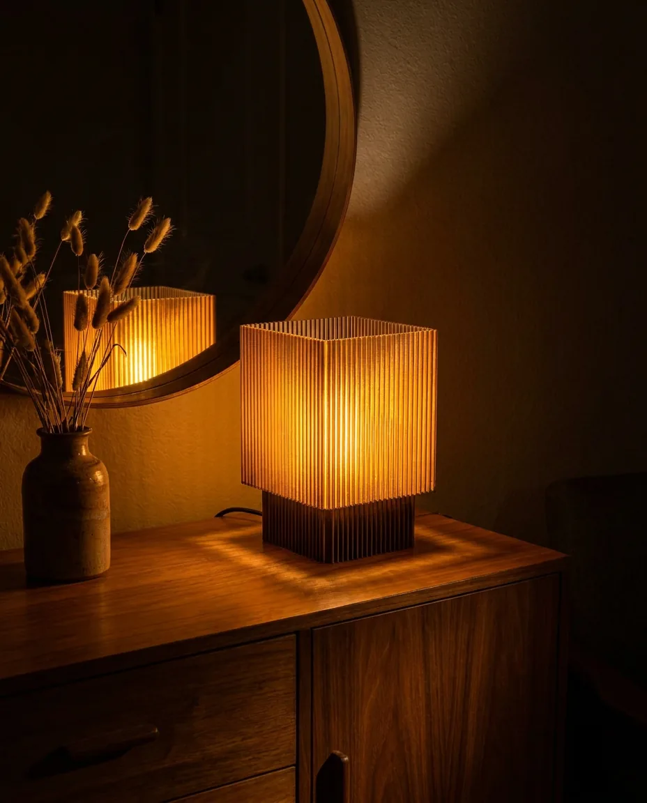
A considered way to bring a colorful table lamp into a room without making the rest of the space feel louder or less settled.
In this story (4 sections)
Treat the lamp as an accent, not a color scheme.
A colorful table lamp does not need to match every cushion, vase, or artwork in the room. It usually feels stronger when it does not. Think of it as one deliberate note in the composition: a green, cobalt, coral, or violet object that gives the room a little tension and makes the neutral elements around it feel more intentional.
The easiest way to choose a color is to decide whether you want the lamp to quietly echo an existing tone or introduce a contrast. Echoes feel settled and tonal. Contrasts feel more graphic. Both can work, but mixing the two approaches at once can make a small object carry too much responsibility.
Look for one or two quiet connections in the room.
A lamp can be the only object in its exact shade, but it should still have company. A green lamp might sit near a plant, a dark olive book spine, or a work of art with a similarly cool undertone. A red or coral lamp can pick up the warmth of timber, clay, or a single textile. These connections do not need to be literal matches. They only need to make the choice feel anchored rather than random.
If the room already has several strong colors, let the lamp take a more supportive role. Choose a finish that is smoky, translucent, or slightly muted so it adds depth without becoming another competing focal point.
Balance color with a shape that has enough calm.
The brighter the finish, the more useful it is for the silhouette to be legible. A well-proportioned dome, ribbed shade, or simple architectural base gives the eye a structure to read before it reacts to the color. That is why a sculptural lamp can still feel composed in a restrained interior: form gives the color somewhere to live.
On a visually busy table, choose a lamp with a calmer outline and clear negative space around it. On a quiet console or shelf, a more expressive shape can hold its own without crowding the room.
Let the glow soften the decision after dark.
A colored lamp is never only seen in daylight. At night, its material, shade geometry, and warmth of light become part of the color story. A translucent finish can become gentler once lit, while a dark base can give a bright shade more visual weight and keep it from reading as decorative for decoration's sake.
Before committing, imagine the lamp in the room at the time you use the room most. The right colorful table lamp should feel personal in daylight and atmospheric when the rest of the space becomes quieter.